6 Essential UX Patterns for Contextual Help in Your Product

Contextual help is an important factor to consider when trying to enhance user experience within a product. It lets users get all the necessary information quickly and helps them acquire proficiency within an app or website in no time. This needs careful consideration in order for it not to be overwhelming – this means choosing the right UX rhythms may require trial-and-error affirmation.
With this being said, there are UX designs that assist far more than just providing simple answers.
They actually exist complementarily with certain hot features of apps and websites, as they kick up application usage or repetition usability in other digital products that have recently experienced increased traffic.
With the aim to guide product designers through creating smart guide structures that provide meaningful assistance throughout the customer journeys interactively and timely.
1. In-line Instructions
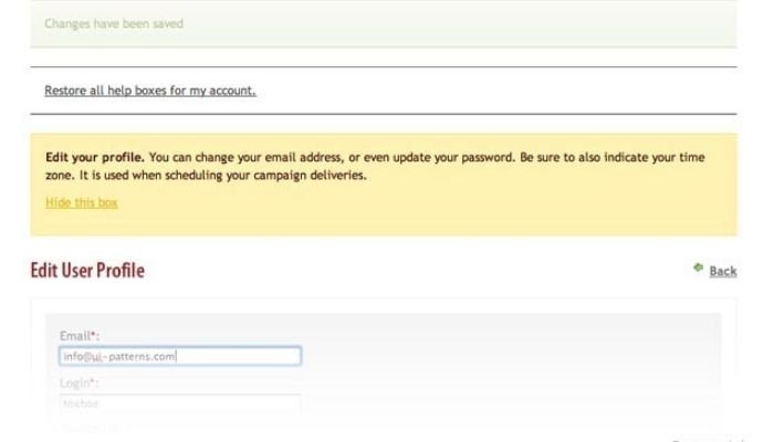
In-line Instructions seek to provide brief just-in-time guidance to the user. These come in short chunks of meaningful information that offer help related to the interface element or action being interacted with.
The purpose of this type of guidance is to answer any instantaneous questions a user might have at any given page without disrupting their navigation experience.
Benefits of using in-line instructions for providing help
In-line instructions are key parts of creating an effective contextual help system, allowing the users to get immediate advice or guidance on how to use a specified feature or element.
Since they appear beside specific actions or input fields, in-line instructions inform users about what action they should take at appropriate times efficiently and quickly.
They also override any guesswork done by possibly confused yet already registered users and help prevent many irritable errors in use cases where huge blocks of text might be difficult to absorb for novice users.
Best practices for implementing in-line instructions
Placement and format help make content easier to discover as visual cues should be designed assuming common processes people associate given tasks with (e.g using checklists). Thus language should be neutral (neither confirming nor criticizing user behavior) and make terminologies for defined concepts consistent.
Using images or graphical aids related to a specific instruction help make more impact and connect easily between what is being said in words and fully understood by users. Finally, placing instructions close to modules that logically need support further reinforce clarity of speech flow ultimately resulting in content simplicity mentioned before.
2. Trigger-based Tooltips
Trigger-based tooltips, also known as hover over help or mouseover help, are mechanisms used to provide contextual instructions and prompts without interrupting the user flow.
Using this type of tooltip, informative text appears either beneath the cursor when it moves over a specific interactive element or above interactive elements only after they have been selected and met certain criteria. This reduces clutter by keeping instructions off the primary navigation space so users can focus on accomplishing their tasks.
How trigger-based tooltips enhance user understanding
Trigger-based tooltips are small, quizzical hints that appear on interaction points like buttons or initiate action links. These tooltips grant users additional details of an object’s purpose without taking them away from the task or cluttering up the UI (user interface).
An effective trigger-based tooltip should ask a user to facilitate certain features by hinting where they may come in handy when enabled by showing just enough information highlighting usage scenarios yet making them intuitive.
For instance, control shortcuts hovering with sufficient contextual messaging not conflicting elements but providing brief descriptions embedded into labels aiding comprehension for non-power user.
Examples of effective implementation of trigger-based tooltips
Trigger-based tooltips essentially capture users’ attention at any given point in their journey and enable quick assistance without affecting overall usability or navigation flow.
Effective implementation of trigger-based tooltips well requires understanding user concerns, needs, and triggers which can differ from person to person. Popular ways of positioning trigger-based tooltips generally involved displaying next to input elements like checkboxes, form fields, and CTA items as those are more susceptible to transitions.
3. Modal Pop-ups

Modal pop-ups are a form of contextual help that allows developers to provide relevant instructions, notifications, and assistance when users interact with certain components in their product.
This type of help can appear as a message box or an informative window that briefly appears over their current interface without interrupting the overall experience.
Thanks to modal pop-ups, users don’t need to spend effort and time finding instructions packed away in other parts of the application because pertinent information is provided in advance when performing tasks.
Advantages of using modal pop-ups
Modal Pop-ups are used to provide contextual help information without interrupting the user’s workflow. As their name implies, they appear as a pop-up window within the active window of the product which should have adequate instructions or tips on how to use it.
They offer various advantages such as allowing focusing the spotlight on individual unique messages and not resorting users to manual searches for help in external documents.
Also, displaying instructional messages only when needed increases user retention because understanding is something important and can happen only if modal pop-ups detect confused behavior from interaction from them.
Considerations for designing modal pop-ups
When designing modal pop-ups, it’s important to ensure they’re essential for the user journey in that particular situation. The modal content should be narrowly focused on a single purpose, and providing only extra optional information to supplement basic essential task instructions should be avoided.
Leave secondary details available in other parts of the help center so as not to overwhelm users too early with similar actions or forces them too quickly into long thoughtless cycles.
Also, careful decisions must be made about reoccurring elements between successive glimpses of this popup – Is it needed every single time? Simple and catchy animation highlighting each step is important for bringing one moment of ease into a usually lengthy process.
4. Help Menus
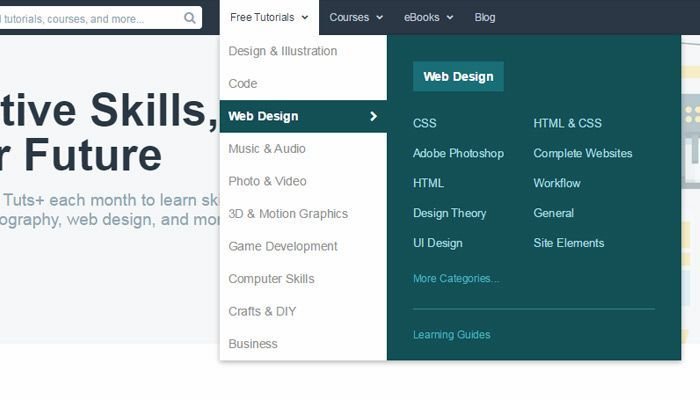
Help menus can be found in many digital products and enable users to easily access contextual help when they need it.
It typically contain a range of FAQs, tutorials, knowledge bases, and other useful information that are related to the product – but not essential for navigating or using it.
Thanks to their congregated nature, these help menus are fast loading and make it easy for user discovery. For complex products, interactive virtual assistants or onboarding wizards all play a role here too in helping guide users whenever they feel lost or uncertain.
Benefits of using help menus
Help menus are extremely useful in providing users with quick access to assistance when browsing apps and websites and help reduce user frustration.
By providing contextual information right at the user’s fingertips, help menus enable enough knowledge points so that users can quickly grasp complex terminology right on the page while maintaining task focus and increasing customer love.
Tips for creating user-friendly help menus
Help menus can simplify user assistance by displaying extensive solutions for completing tasks or navigating the interface. Here are some tips on creating user-friendly help menus:
- Make sure menus contain big readable font so users have an easier time scanning them
- Break down long menu navigation pathways into simple and consistent components which offer only a few major options
- Strategically design hierarchies of submenus that organize content in a purposeful flow
- Strive for fast loading times given today’s short attention span expectation of quick navigation
- Consider adding dynamic filters and an effective search bar that address broader help requirements
5. Onboarding Checklists

Onboarding checklists are tools used to quickly guide a user through the onboarding process. The purpose of these lists is two-fold – they provide users with an organized list of tasks as well as cues to follow in order to set up and get comfortable with a product or service.
Onboarding checklists are designed within context so that guidance is timely, guided visually, and not ambiguous making the experience advantageous for users from product experts to novices.
How onboarding checklists assist users in getting started
Onboarding checklists provide clear and comprehensive guidance throughout a user’s onboarding process. By guiding users in a step-by-step sequence, checklists give users the support they need to quickly become comfortable with the product.
More importantly, fixed items that cover all of the most essential elements prevent users from having sub-optimal experiences due to omitting required steps or actions. In addition, updating core steps in response to improved UI/UX design lets developers keep an onboarding checklist dynamic and useful considering the ever-changing wanted user flow.
Examples of successful onboarding checklist implementation
Onboarding checklists make it easy for novice users to start using a product by providing clear exploration guidelines and pointing out appropriate areas in the platform.
Checklist objectives could range from exploring interface essentials to uncovering important website features. Successful onboarding checklists offer both an accurate summary of key user needs and simplified choreographies of the critical resources of the product.
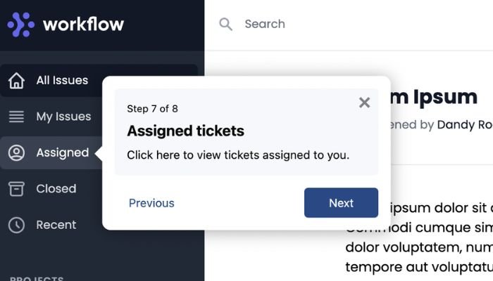
6. Guided Tours

Guided tours are an effective UX pattern to provide contextual help. They offer an overlay showing a sequence of important features and functionality in the product, allowing users to self-discover and learn quickly.
Other than guiding some actions with step-by-step instructions, these tours explain through images and components actively present in the user interface— design elements keep updating after completing each stage for extra risk-free education chances.
Advantages of using guided tours for user guidance
Guided tours are key elements in contextual help that progressively guide users through tasks the first time they enter an application or web page interface.
Several advantages come with implementing guided tours, such as giving rookie users more confidence as the introduction to a product will aid their knowledge of navigation, thus allowing them to actively engage quicker in terms of user productivity.
Key elements to consider when designing guided tours
When designing guided tours, there are several key elements to consider in order to create a successful user experience.
It is best practice to keep tour steps short and depict each element of functionality propelling the users towards completion of core tasks beforehand. Additionally, user flows through the site or product must be taken into account so tutorial segments can lead them to more premium functions and capabilities as soon they complete it.
Conclusion
Contextual help plays an important role in enhancing user experience. Over the past few years, a variety of UX patterns have emerged to provide fulfillment content marked with precision and relevancy at the perfect moment when needed.
In this article, we’ve gone through some of these crucial software patterns including in-line instructions, tooltips, modals & pop-up assists that are essential for contextual assistance.
Developing User Experience becomes more critical when delivering the appropriate help at the right moment with adequate ease. Therefore, care must be taken while investing time in understanding and choosing the best contextual help patterns for improved user outcomes.
- Creating a Knowledge Base: A Simple Guide to Building one - September 12, 2023
- Enhancing Engagement Rates and Achieving Greater User Retention - August 29, 2023
- 5 Strategies for Enhancing Customer Experience and Driving PLG - August 15, 2023